Chopsticks
CASE STUDY
Creating a logo-driven brand by redesigning the existing logo of Chopsticks, a Vietnamese-fusion restaurant based in Hutto, TX.
MISSION STATEMENT
"Our mission is simple yet profound: to fill every plate with delight and every heart with the touching taste of home."

Research
Instead of moodboards, we were tasked with going to the physical location to learn more about our "client" and their preexisting branding. After that, we wrote about a creative brief and started sketching.


Digital Drafts
For the digital drafts, I explored many typefaces and tried to incorporate elements from the preexisting logo.


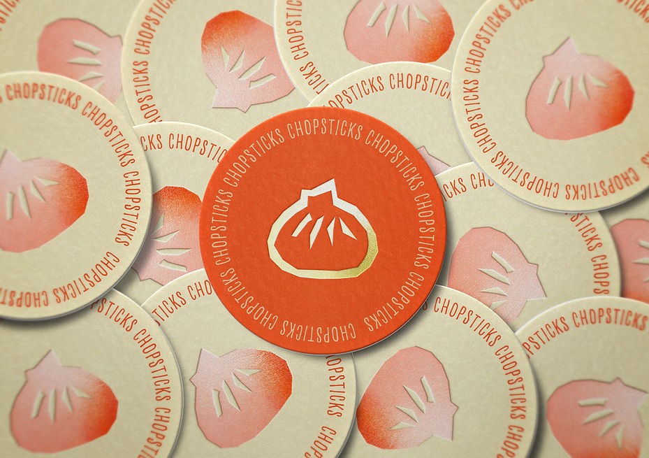
Final Logo
In the end, I leaned more into thin, chopstick-like letters and a logo with a bao (or dumpling), which is a common dish across many cultures and represents warmth and fullness wrapped up in a soft, fluffy dough.