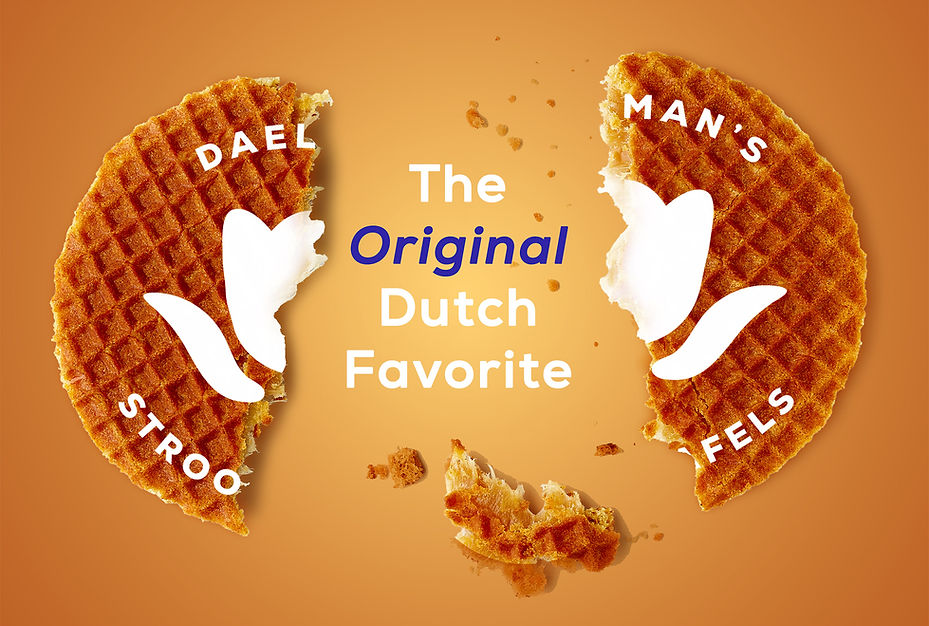
Daelmans Stroopwafels
CASE STUDY
Product packaging redesign with attention to illustration and typography.
MISSION STATEMENT
This redesign was meant to replace the graphics and standard packaging design made for Daelmans Stroopwafels. I sought to accomplish this by keeping the content, but by adding a little twist to the format.

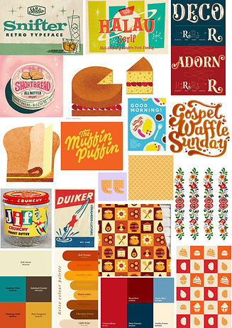
Moodboard
I wanted to reflect Daelmans values for craftmanship, warmth, flavor, and tradition,
while also giving the packaging a more modern and stylized feel. I originally wanted to give it a
mid-century modern redesign, hence the products, colors, and textures. Texture can offer a handmade, reliable feeling to a design, which I wanted
to lean into.
Sketches
Many of my sketches take inspiration from the mid-century modern illustrations I chose in my moodboard. A challenge I ran into was finding a way to make the front panel type-forward, while also adding some elements that would improve the design, not distract from it.


Digital Drafts
There are so many wonderful typefaces out there, but for this project, I had something specific in mind. It was just a matter of finding a few that worked together, as well as finding a contrasting color palette that didn't clash with the feel of the fonts.


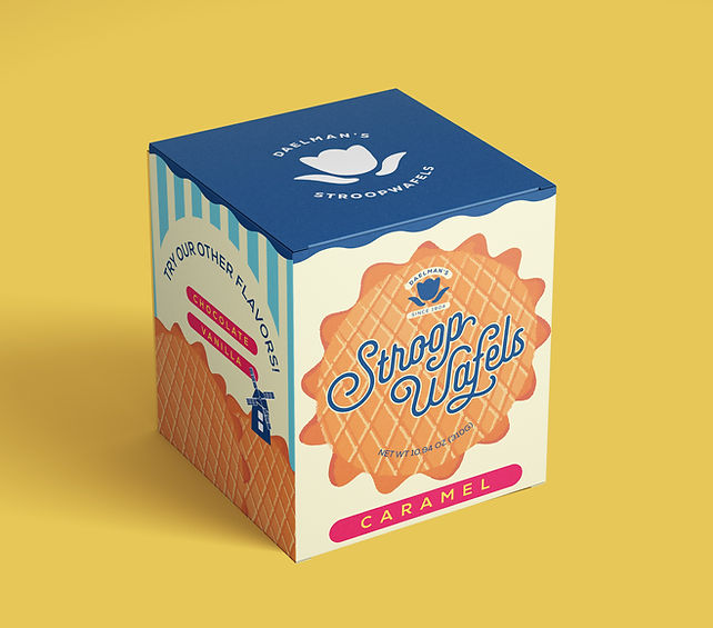
Final Packaging
Overall, I'm happy with how this turned out. The most challenging part for me was getting the colors just right. It was really cool to have it printed out and assembled, and to understand the process of creating a die-line.